

P0001
P0001
Milano_Int02
Milano_Int02

P0005
P0005

P0001
Open with Preview
Faculty of Architecture and Design
Design, Technology and Society Graduate Program
Industrial Design Undergraduate Program
Exploring Analog & Digital Practices
A visual identity and website designed for an ethnographic study examining analog and digital everyday practices. Exhibited at Interdependence 2025 within Milan Design Week.
Exploring Analog & Digital Practices
Project supervisor
Prof. Dr. Şebnem Timur
Design team
Görkem Çolak, Cansu Akverdi
Authors
Cansu Akverdi, Elif İlbay, Elif Özgüder, Görkem Çolak, Naz Bölükbaşı, Nihan Aksoy, Yusuf Dönmez
Contributors
Ayşe Yıldız Büyükşahin, Beren Ay, Dila Ferhatoğlu, Duru Su Dolap, Duru Şevketbeyoğlu, Edvin Mert Cincioğlu, Efe Gezen, Irmak Özmenek, İrem Timur, İsmail Umut Yüzer, Lara Özpetek, Melis Akti, Mina Yersal, Nil Palaz, Şükrü Hakan Oral, Tarık Şahin, Tuana Ildız, Zeynep Yaşar, Zeynep Yazıcı, Zülal Koç
Acknowledgements
I used the macOS elements in the hero section to make the project more aesthetically appealing, without any commercial intent (see Apple Design Resources License Agreement, Sections 2.A. and 2.B.).
Publish date
April 2025
Category
Exhibition
1
About the project
The ethnographic research project introduced in this project, which explores analog and digital practices in everyday life, was developed through a group of articles by graduate students from the Design, Technology and Society program at Özyeğin University, each addressing one of seven distinct subthemes.
The authors focused on individuals' relationships with analog methods and relatively more recent technologies in their daily routines. Data was collected from participants in three separate age groups (20 to 40, 40 to 60, and 60+). Twenty undergraduate students from Özyeğin University's Industrial Design department contributed to the data collection process by conducting interviews.
Under the supervision of Prof. Dr. Şebnem Timur, the project was carried out by a team of nearly thirty people. In addition to designing the visual aspects of the project, I also wrote an article examining analog and digital timekeeping methods through the lens of Actor-Network Theory.
Prof. Dr. Şebnem Timur’un danışmanlığında yaklaşık otuz kişilik bir ekiple yürüttüğümüz bu projede, ben de zaman tutma pratiklerinde analog ve dijital yöntemleri Aktör-Ağ Teorisi çerçevesinde incelediğim bir makale yazdım.
The authors focused on individuals' relationships with analog methods and relatively more recent technologies in their daily routines. Data was collected from participants in three separate age groups (20 to 40, 40 to 60, and 60+). Twenty undergraduate students from Özyeğin University's Industrial Design department contributed to the data collection process by conducting interviews.
The authors focused on individuals' relationships with analog methods and relatively more recent technologies in their daily routines. Data was collected from participants in three separate age groups (20 to 40, 40 to 60, and 60+). Twenty undergraduate students from Özyeğin University's Industrial Design department contributed to the data collection process by conducting interviews.
Yazarlar, bireylerin günlük rutinlerinde analog yöntemler ve görece daha güncel uygulamalarla ilişkilerine odaklandı. Çalışmalar için üç yaş grubundan (20 ila 40, 40 ila 60 ve 60 yaş üstü) veri toplandı. Özyeğin Üniversitesi Endüstriyel Tasarım bölümünden yirmi lisans öğrencisi, katılımcılarla mülakatlar gerçekleştirerek veri toplama sürecine katkıda bulundu.
The ethnographic research project introduced in this project, which explores analog and digital practices in everyday life, was developed through a group of articles by graduate students from the Design, Technology and Society program at Özyeğin University, each addressing one of seven distinct subthemes.
The ethnographic research project introduced in this project, which explores analog and digital practices in everyday life, was developed through a group of articles by graduate students from the Design, Technology and Society program at Özyeğin University, each addressing one of seven distinct subthemes.
The ethnographic research project introduced in this project, which explores analog and digital practices in everyday life, was developed through a group of articles by graduate students from the Design, Technology and Society program at Özyeğin University, each addressing one of seven distinct subthemes.
The authors focused on individuals' relationships with analog methods and relatively more recent technologies in their daily routines. Data was collected from participants in three separate age groups (20 to 40, 40 to 60, and 60+). Twenty undergraduate students from Özyeğin University's Industrial Design department contributed to the data collection process by conducting interviews.
Under the supervision of Prof. Dr. Şebnem Timur, the project was carried out by a team of nearly thirty people. In addition to designing the visual aspects of the project, I also wrote an article examining analog and digital timekeeping methods through the lens of Actor-Network Theory.
Under the supervision of Prof. Dr. Şebnem Timur, the project was carried out by a team of nearly thirty people. In addition to designing the visual aspects of the project, I also wrote an article examining analog and digital timekeeping methods through the lens of Actor-Network Theory.
Under the supervision of Prof. Dr. Şebnem Timur, the project was carried out by a team of nearly thirty people. In addition to designing the visual aspects of the project, I also wrote an article examining analog and digital timekeeping methods through the lens of Actor-Network Theory.
1
1
1
1
Kullanıcı deneyimi
About the project
About the project
About the project
2
Design process
To support the presentation of the ethnographic research project at Interdependence 2025, Cansu and I designed a representative logo and website. We began the design process guided by three main objectives.
Enhancing accessibility of the findings
Our primary goal was to present the ethnographic study within a framework that allows people outside the field to explore and engage with it. We aimed to contribute to the project's impact from a science communication perspective.
Making contributors recognized
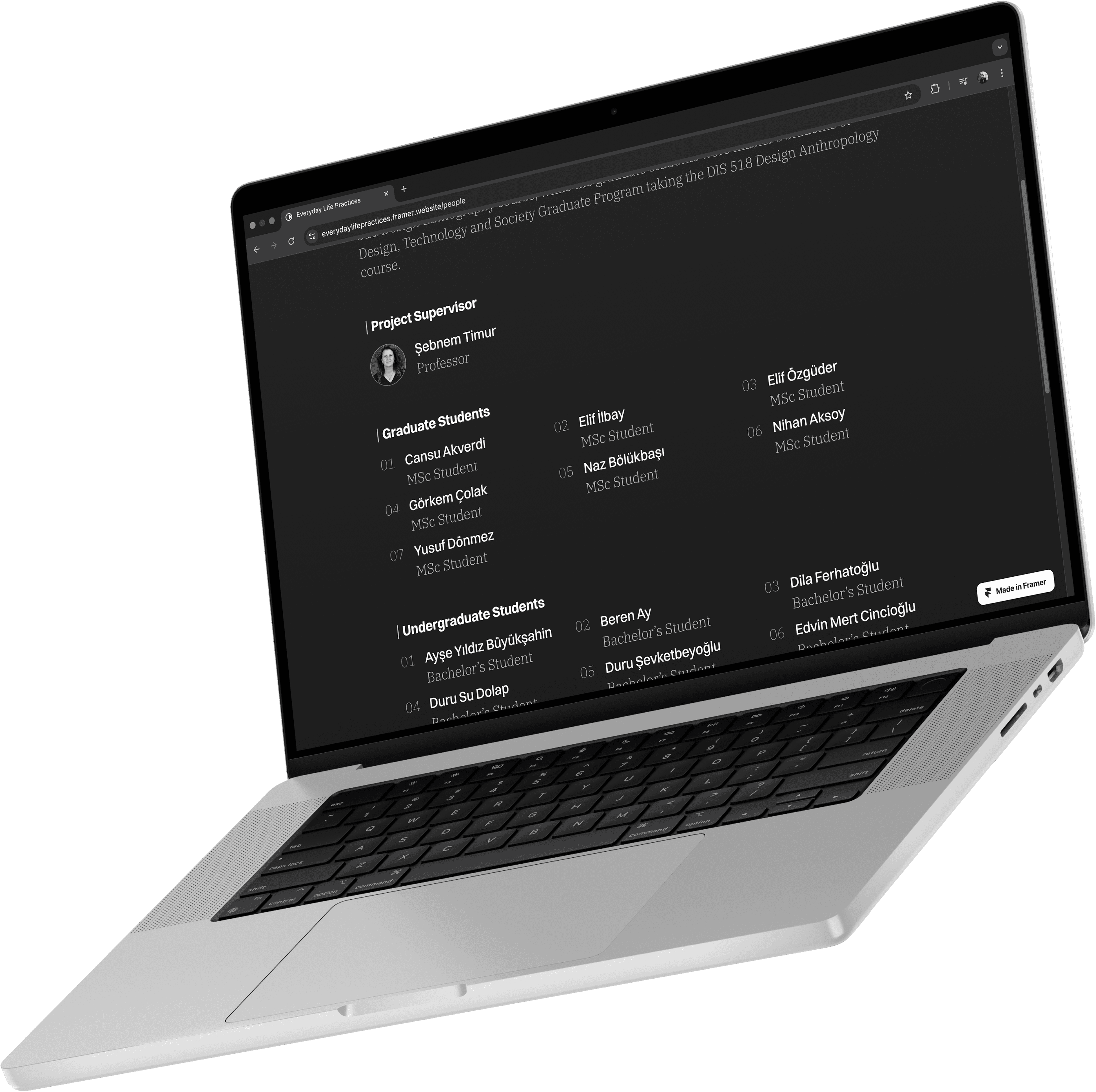
Around thirty people contributed to the research process alongside our supervisor. When designing the project's website, we wanted to acknowledge and make the efforts of this team visible to the people interested in the project.
Establishing an accurate visual and conceptual identity
While designing a logo and website to present the ethnographic work, we also focused on visually distinguishing the project from other ongoing research in the field and creating a unique, recognizable identity.
To support the presentation of the ethnographic research project at Interdependence 2025, Cansu and I designed a representative logo and website. We began the design process guided by three main objectives.
Enhancing accessibility of the findings
Our primary goal was to present the ethnographic study within a framework that allows people outside the field to explore and engage with it. We aimed to contribute to the project's impact from a science communication perspective.
Making contributors recognized
Around thirty people contributed to the research process alongside our supervisor. When designing the project's website, we wanted to acknowledge and make the efforts of this team visible to the people interested in the project.
Establishing an accurate visual and conceptual identity
While designing a logo and website to present the ethnographic work, we also focused on visually distinguishing the project from other ongoing research in the field and creating a unique, recognizable identity.
To support the presentation of the ethnographic research project at Interdependence 2025, Cansu and I designed a representative logo and website. We began the design process guided by three main objectives.
Logo design
The logo we chose to represent a study scrutinizing analog and digital practices in everyday life embodies several themes that the project suggested to us at first glance.
The logotype structure creates a strong contrast with its background. To best represent a project focused on the contradictions embedded in daily life, we preferred a simple yet powerful style centered around words and colors to emphasize the conflict.
I intended to disrupt the typographic structure of the logo with a box figure referencing the concept of the black box, commonly used in science and technology studies. The black box concept refers to products and systems accepted solely for their outputs, without being questioned for the complex processes involved in their emergence. Many objects and routines embedded in everyday life are similarly used without scrutiny. Accordingly, the white text and white box in the dark theme visualize how the untouchability associated with the black box metaphor extends into daily practices, such that the only element that does not darken is the box (and the text) itself. That was the base for the idea.
Logo tasarımı
Logo design
Logo design
Logo design
The logo we chose to represent a study scrutinizing analog and digital practices in everyday life embodies several themes that the project suggested to us at first glance.
Gündelik hayatta analog ve dijital pratiklerin izini süren bir çalışmayı temsil etmesi için seçtiğimiz logo, projenin bize ilk bakışta sezdirdiği bazı temaları bünyesinde barındırıyor.
The logo we chose to represent a study scrutinizing analog and digital practices in everyday life embodies several themes that the project suggested to us at first glance.
The logo we chose to represent a study scrutinizing analog and digital practices in everyday life embodies several themes that the project suggested to us at first glance.
Logo metin ağırlıklı bir yapıda ve zeminle güçlü bir kontrast içinde. Merkezinde sözcükler olan ve gündelik hayatta barınan zıtlıklara odaklanan projeyi en doğru şekilde temsil edebilmesi için bu minimalist logoyu tercih ettik.
The logotype structure creates a strong contrast with its background. To best represent a project focused on the contradictions embedded in daily life, we preferred a simple yet powerful style centered around words and colors to emphasize the conflict.
The logotype structure creates a strong contrast with its background. To best represent a project focused on the contradictions embedded in daily life, we preferred a simple yet powerful style centered around words and colors to emphasize the conflict.
The logotype structure creates a strong contrast with its background. To best represent a project focused on the contradictions embedded in daily life, we preferred a simple yet powerful style centered around words and colors to emphasize the conflict.
Logonun tipografik yapısını bilim ve teknoloji çalışmalarında yaygın olarak kullanılan kara kutu (black box) kavramından ilhamla bir kutu figürüyle kırmak istedim. Kara kutu kavramı, barındırdığı karmaşık süreçler sorgulanmadan, yalnızca çıktılarıyla kabul edilen ürün ve sistemleri temsil ediyor. Gündelik yaşama yerleşmiş pek çok obje ve alışkanlık da benzer şekilde sorgulanmadan kullanıldığı için, koyu temaya yerleşen logoda beyaz metin ve beyaz kutu, kara kutu metaforunun sahip olduğu dokunulmazlığın gündelik pratiklere nasıl yayıldığını görselleştiriyor — öyle ki kararmayan tek unsur, kutunun kendisi oluyor. Yani, evet.
I intended to disrupt the typographic structure of the logo with a box figure referencing the concept of the black box, commonly used in science and technology studies. The black box concept refers to products and systems accepted solely for their outputs, without being questioned for the complex processes involved in their emergence. Many objects and routines embedded in everyday life are similarly used without scrutiny. Accordingly, the white text and white box in the dark theme visualize how the untouchability associated with the black box metaphor extends into daily practices, such that the only element that does not darken is the box (and the text) itself. That was the base for the idea.
I intended to disrupt the typographic structure of the logo with a box figure referencing the concept of the black box, commonly used in science and technology studies. The black box concept refers to products and systems accepted solely for their outputs, without being questioned for the complex processes involved in their emergence. Many objects and routines embedded in everyday life are similarly used without scrutiny. Accordingly, the white text and white box in the dark theme visualize how the untouchability associated with the black box metaphor extends into daily practices, such that the only element that does not darken is the box (and the text) itself. That was the base for the idea.
I intended to disrupt the typographic structure of the logo with a box figure referencing the concept of the black box, commonly used in science and technology studies. The black box concept refers to products and systems accepted solely for their outputs, without being questioned for the complex processes involved in their emergence. Many objects and routines embedded in everyday life are similarly used without scrutiny. Accordingly, the white text and white box in the dark theme visualize how the untouchability associated with the black box metaphor extends into daily practices, such that the only element that does not darken is the box (and the text) itself. That was the base for the idea.
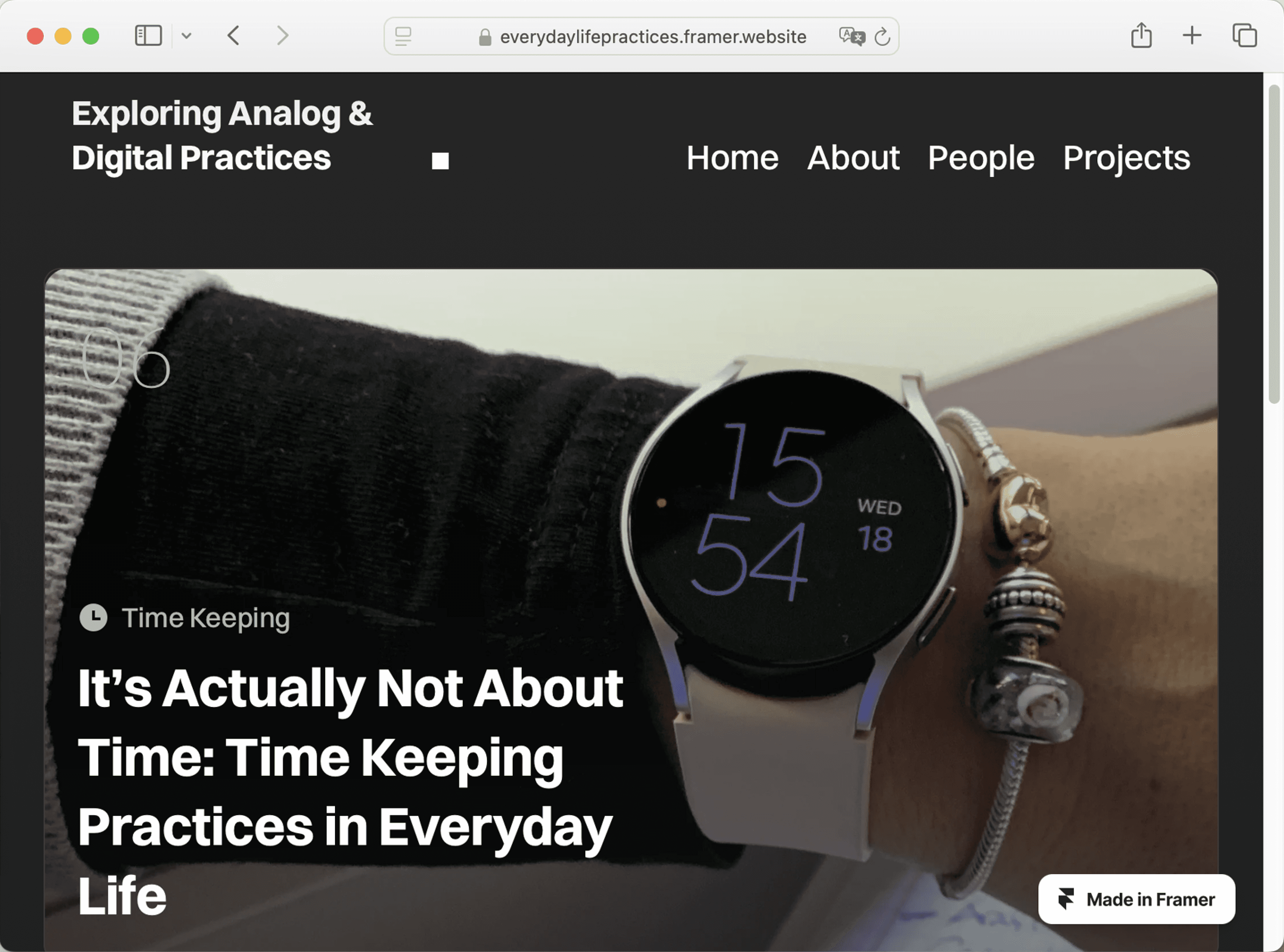
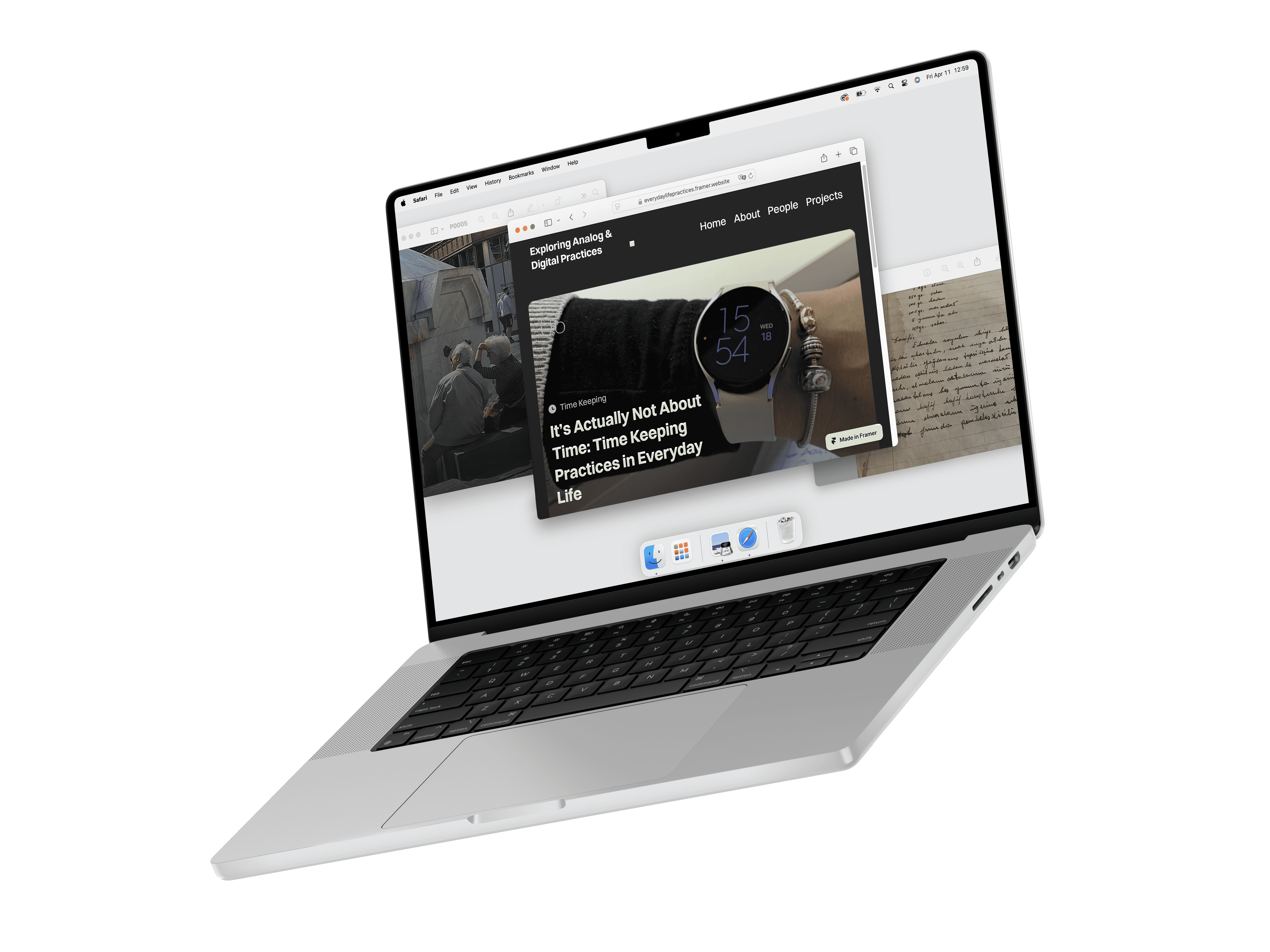
Website design
We designed the project's website with a hierarchy that focuses on the content of the work and the contributors, to ensure integrity with the logo's visual identity. Website content was grouped under four main categories, and we developed a navigation system that allows users to move between these sections easily.
Exploring Analog & Digital Practices
Exploring Analog & Digital Practices
Website design
We designed the project's website with a hierarchy that focuses on the content of the work and the contributors, to ensure integrity with the logo's visual identity. Website content was grouped under four main categories, and we developed a navigation system that allows users to move between these sections easily.
Journery’nin arayüz tasarımı sürecinde, projenin ihtiyaçlarını karşılamak ve uygulamaya özgün bir görsel kimlik kazandırmak için projeye özel bir UI Kit tasarlaması gerekiyordu. Bu yüzden Journery’nin butonlarını, renk paletlerini ve tüm bileşenlerini sıfırdan tasarladım. Benim için çeşitli güçlükleri bulunan ama öğretici bir süreçti.
We designed the project's website with a hierarchy that focuses on the content of the work and the contributors, to ensure integrity with the logo's visual identity. Website content was grouped under four main categories, and we developed a navigation system that allows users to move between these sections easily.
We designed the project's website with a hierarchy that focuses on the content of the work and the contributors, to ensure integrity with the logo's visual identity. Website content was grouped under four main categories, and we developed a navigation system that allows users to move between these sections easily.
UI Kit tasarımı
Website design
Website design
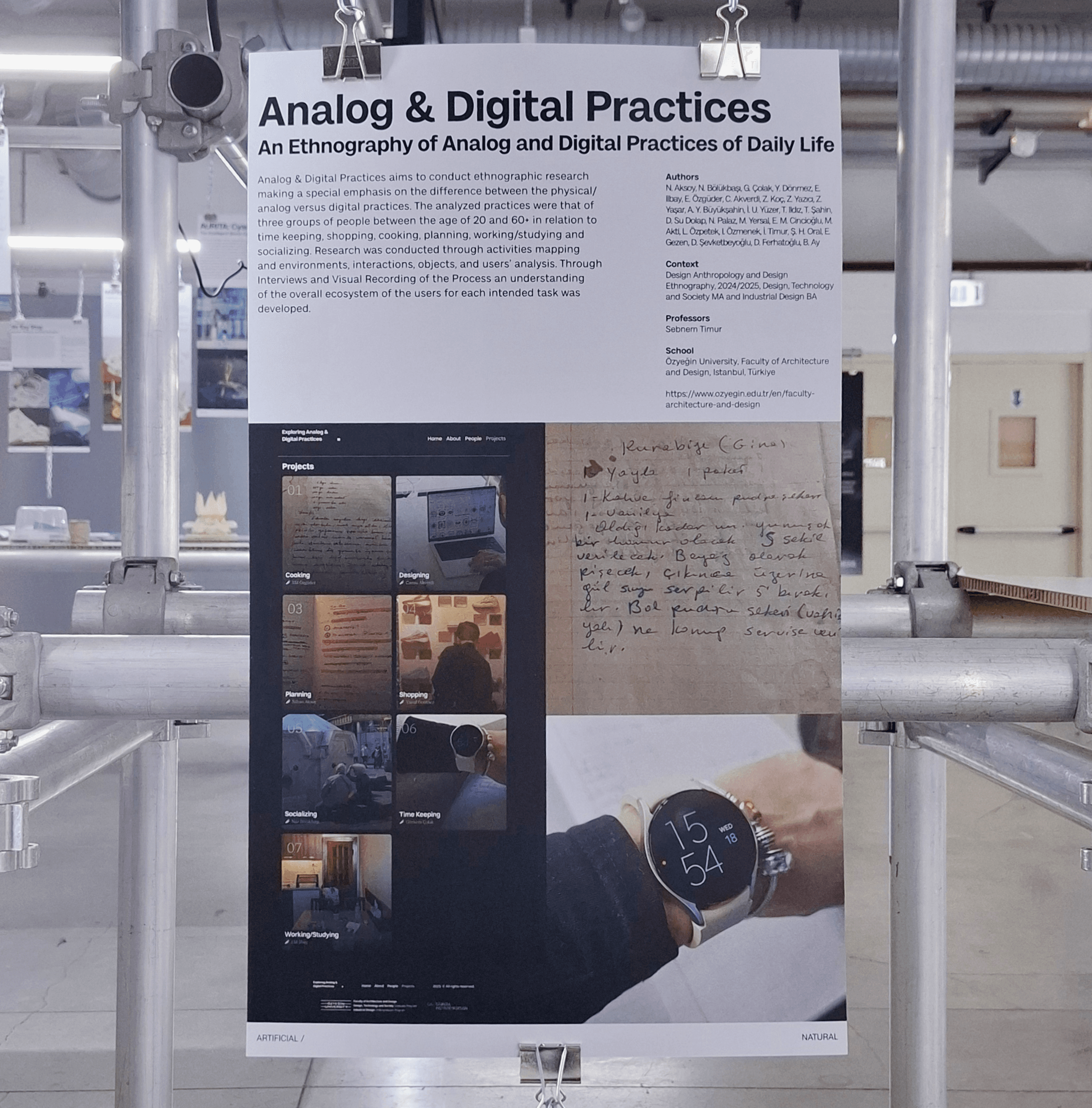
Exhibition process
The project in which we aimed to explore analog and digital practices was curated for the Interdependence 2025, organized by Politecnico di Milano in Italy. The project and its design elements were exhibited alongside around forty esteemed design schools.
Although I could not attend the exhibition in person due to visa issues, having a project for which I am both designer and author showcased in such a valuable organization was an honor.
I am especially grateful to the exhibition designer Debora Baratta for the outstanding photographs she took and shared with me.


Photos by
Debora Baratta
Photos by
Debora Baratta

Photos by
Debora Baratta
Tools and resources
Adobe Photoshop is used to prepare all the static mockup images created for the project.
Figma was the platform where I designed and refined every project stage. I also created the project logo in Figma.
Rotato is a software that helps present UIs with a realistic look and animated previews. The motion mockups featured in the project were created using this tool.
Typescale is an online service ensuring proportional text size scaling across various use cases. We defined the project's text scaling with its help.
Project owner

Görkem Çolak
Görkem Çolak © 2025
Kullanımlar izne tabidir.
2025 © Kullanımlar izne tabidir.
Görkem Çolak © 2025
Kullanımlar izne tabidir.